Designing Brevo's navigation for scale
From a marketing platform
to a multi-product CRM experience.
Over four years, I led the evolution of Brevo's global navigation, from replacing a navigation model that could no longer scale, to rethinking its Information Architecture and preparing it for AI-powered product experiences
Company : Brevo — European SaaS CRM unicorn, serving 600,000+ customers globally across Marketing, Sales and Customer Experience.
Role : Design System & Global Experience Lead
Scope : Navigation Strategy · Information Architecture · Interaction Design · Design System · Product Rollout
Timeline: 2022 to 2026 + vision for 2027
Collaboration: Design System · Content Design · UX Research · Product · Engineering
01 – The challenge was not fitting more products. It was making Brevo understandable.

Over the years, Sendinblue had evolved from a marketing platform into a broader CRM suite with Marketing, Sales, Conversations, Transactional messaging, and more.
The navigation had grown alongside the product portfolio.
A horizontal navigation exposed the main products, while each product had its own nested sidebar. To keep this growing ecosystem manageable, users could activate or deactivate products — hiding the ones they didn't need.
It worked when the suite was smaller, but created a discoverability problem as Brevo expanded. Capabilities users hadn't activated were largely invisible, making it difficult to understand what else the platform could do. Research also showed that users could struggle to locate features across product boundaries, while the overall menu was perceived as increasingly complex.
At the same time, the navigation increasingly reflected how Brevo was internally structured into products, rather than how customers thought about their work, creating a growing disconnect with user mental models.
Our problem became:
How might we design a navigation model that could scale with Brevo while making its growing product ecosystem easier to discover and understand?
02 – 2023: Designing the foundation
I led the navigation redesign as part of the Sendinblue → Brevo transformation.
Rather than redesigning each product centrally, we involved Product and Design teams as domain experts, while I worked with Content Design and UX Research to consolidate the experience into a shared architecture.
I personally designed the navigation interaction model and component system.
Three principles shaped the solution:
Expose, don't hide
Make the product ecosystem discoverable.Three global levels maximum
Keep deeper complexity inside individual products.Separate global from local
The sidebar owns product navigation; the Global Header owns cross-product experiences.
One important decision: we deliberately didn't redesign everything.
Research showed that the Information Architecture still needed work.
But combining a new brand, a new navigation paradigm and a completely new IA would have forced users to relearn too much at once.
We shipped the structural change first and deferred the deeper IA transformation.
03 — 2025: From product structure to user intent
Once the structural model had proven itself, we tackled the problem we had deliberately deferred.
Brevo had matured into a clearer CRM suite, with better-defined personas and workflows.
I led the evolution of the IA with Content Design, moving from a feature-based structure to a Role + Action model:
Instead of asking
“Where does this feature belong?”,
we asked
“Who is the user, and what are they trying to accomplish?”
This led to four recurring user intents:
Work · Monitor · Organize · Set up
The resulting architecture centralized areas such as Settings, Assets into Libraries and Reporting while making Brevo's broader capabilities easier to understand and discover.
04 — Shipping change, not just designs
The work didn't stop at defining the model.
In 2023, the DS team built the navigation system before frontend teams across Brevo integrated it ahead of the rebrand. We supported the rollout through enablement sessions and Design QA across products before the reveal day.
For the 2025 IA evolution, we deliberately rolled out progressively:
1% → 10% → 50% → 100%
This allowed us to monitor behaviour and feedback, identify friction, and adjust the experience before expanding exposure.
05 — Designing for what comes next
2026
The latest evolution introduced a Layout Framework supported by a new Grid component, allowing navigation and product content to adapt responsively across complex layouts.
Responsiveness was essential as global navigation and contextual surfaces became dynamic. It was also a necessary foundation for AI-assisted workflows, where persistent drawers push and resize the product canvas rather than simply overlaying it.
2027
The 2027 vision takes this further: Account, Settings and Help move into the sidebar, freeing the Global Header to prioritize Global Search and the AI Assistant as the main cross-product entry points.
06 — The outcome: change takes time but it pays off.
Transforming a global navigation isn't a one-off redesign.
At this scale, meaningful change comes from sequencing the right decisions over time.
We deliberately built the transformation in stages: establishing a scalable foundation first, evolving the Information Architecture once Brevo's product vision and user roles had matured, then extending the same system to support responsive and AI-assisted experiences.
This progressive approach allowed us to improve the experience without overwhelming users or repeatedly rebuilding its foundations.
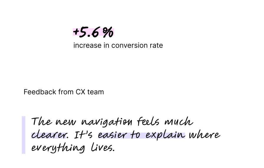
And it paid off: one month after the 2025 rollout, the new navigation delivered a +5.6% increase in conversion rate compared with the previous experience.
The result is not a navigation that never changes,
but a system designed to evolve with the business and user needs.